


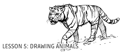

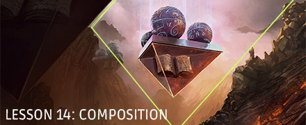
Lesson 14: Composition
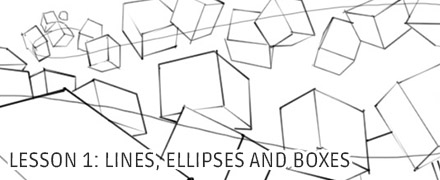
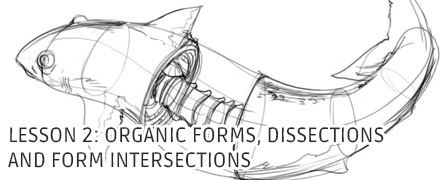
Lesson 1 and Lesson 2 should be completed before moving onto this subject. They cover the basic mechanics of drawing and essentially help you work towards gaining a greater degree of control over your body. Regardless of whether you choose to work traditionally or digitally, a degree of mastery over your hand, arm and body will greatly increase your ability to transfer your intentions to your canvas. If you are making the transition into digital media, be sure to complete those first two lessons **traditionally first**, and then spend some time completing the same exercises in your new medium.
Traditional Media and Digital Software
I'll be upfront - the vast majority of my experience with illustration has been through digital painting. From here on in, I'm going to be looking into topics relating to this in greater depth, whereas until now it's all been topics that align with traditional media.
If you wish, you can absolutely still tackle all, most, or at least some of this content traditionally. What's important is that with whatever medium you choose, you set fine lines aside and begin thinking in terms of shape. Some tools are better made for line, while others are better suited for shape. If you wish to work traditionally, you may want to consider working in paint (watercolour, gouache, acrylic, oil, etc) or in marker (many brands such as copic sell some rather nice wide markers that come in a various colours, though we'd focus more on the range of cool or warm greys).
At the end of the day, I cannot offer much advice when it comes to the traditional media, so you'll probably get the most out of these lessons if you're working digitally. Again, I'm not going to pidgeonhole anyone into any particular piece of software, and the concepts I cover will be applicable to all major software packages. I, however, will be using Adobe Photoshop CC 2014, which is available for $9.99USD/month in their Photography plan. There are other software packages as well, such as Corel Painter 2015, Krita (which is free), and others.
Graphics Tablets
Regardless of which piece of software you choose, if you do decide to go the digital route, you will likely need a tablet. Wacom have been at the head of the graphics tablet game for longer than I can remember, but they are also the priciest with their lower end running you $200 and their intermediate/professional line running you $350 (note, these are the prices for the medium sizes - the smalls are cheaper, but I've always found that size to be too limiting). Luckily, the alternatives available these days are looking much better than they once did, so if y ou're just starting out, be sure to check those out. Read reviews, try them out if you can. If you're just a beginner, it's not just a matter of you not needing the intermediate/professional options - you won't even be able to tell the difference. I do not recommend that beginners opt for the drawing-on-a-screen type of tablet. They'll make the learning curve easier for sure, but they're expensive as hell and if end up needing the most expensive tech out there just to function, you'll be digging yourself a neat little grave for the future.
Illustration, Part 1
Okay. So, from the time I started writing lessons back in August 2014, everyone's been clamouring for me to teach more interesting subjects. I made the conscious decision to put that off, however, because people have a tendency to get distracted by interesting things. If you rush ahead because you find drawing a hundred boxes to be beneath you, you will not do well. You'll improve, sure - but you will eventually hit a ceiling. So, be warned. On top of the basics (lessons 1 and 2), you would be wise to complete every lesson prior to this one (dynamic sketching and analytical figure drawing) but I will not force it upon you. You can also choose to do them in parallel.
There's a few definitions of 'illustration,' but if you ask me, I'll give you only one. To illustrate is to tell a story, and to do so in a single frame. To capture a perfect representation of a scene in a moment, in a cross-section of time. No explanation, no dialogue, only a single snapshot.
The thing I like best about illustration is that there is only so much you can do to control what the viewer understands. At the end of the day, the scene is left up to their interpretation, so while I may have a very specific scene in mind, they may see something very different. Personally, that is something I like to take advantage of - when your audience is able to introduce a bit of themselves into their experience of your illustration, it engages them and makes it personal.
Rather than give answers, I like it best when I can raise questions. What is happening? Why?
This has various applications. Not only does it engage a viewer, but it also makes them curious. At the end of the day, illustration is a major facet of commercial art - these illustrations are used in posters, book covers, advertisements of every sort. If someone is made curious at a glance, they're that much more likely to buy what you're selling.
But we're getting ahead of ourselves - how can you even begin to tell a story in a single image? Even a comic requires a series of sequential images, walking their reader through a scene.
The important thing to note here is that a single frame can contain a wealth of information, and there is no way a viewer will absorb it all at once. The eyes move around, taking in elements bit by bit, attempting to make sense of it. It is absorbed much like the images of a comic strip - starting with one element, then moving to the next, etc.
The trick is, we need some way to control the order in which they visit these different parts of our image. How do we do that? Composition.
Composition is the science of leading your viewer's eye around the page. In order to do so, you must understand what draws the eye and what pushes it away. We're predictable, like sheep being herded down a path, though we don't even know it.
As it is a very involved subject, this lesson is extremely long and is not intended to be digested fully in one sitting. Instead, it works a bit more like a list of solutions to problems that will come up. Read over it, but don't focus too much on absorbing what you're reading. Then, as you work on the exercises, you may find yourself referring back to certain sections.
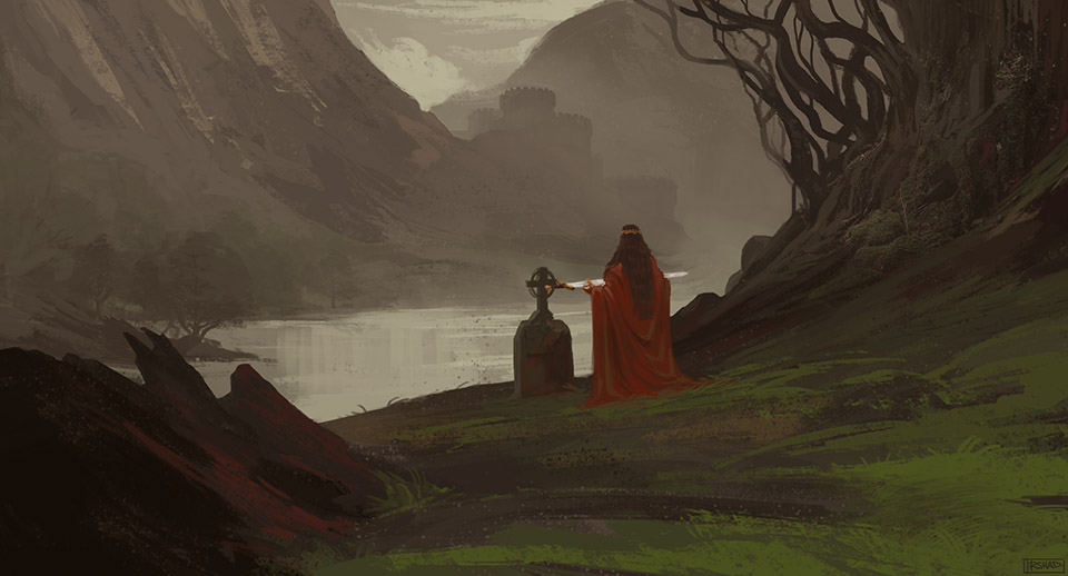 Figure 1.1
 For now, let's set aside all of this lofty talk of storytelling and cross-sections of time. The first thing we need to talk about in earnest is organizing our images. There's no way we'll be able to structure our illustrations to lead our viewers' eyes around unless we start off by recognizing the hierarchy of values.
Above, you'll see a sketch I did in January 2015. A coloured painting has a whole lot going on. Colour's got three dimensions, and we can see all of them in action here.
- Value (dark to light)
- Saturation (grey to vivid colour)
- Hue (the spectrum of colour)
With all of that information in front of us, it's a little trickier to see the shapes that make up the underlying structure of the image. Lets start off by stripping off saturation and hue, leaving only value - a greyscale image.
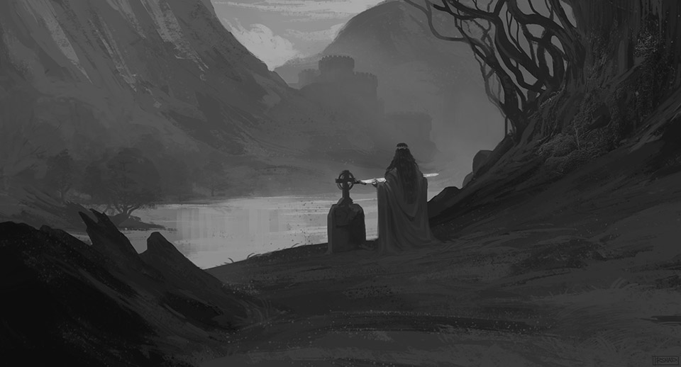 Figure 1.2
 That's a little better. The shapes are getting a little clearer, but we still have a lot of unimportant details that are obscuring or major shapes.
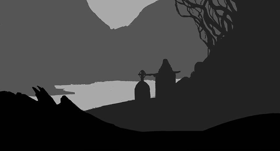 Figure 1.3
 As we continue to strip things away, we start to see a hierarchy of information - we're getting rid of the frivolous extras. What's left is the core of the image. But we're not done yet. Here we can see the image split up into four major values, but we've got a lot of complex, interesting shapes. These are definitely important, but what we really want to see right now are the most basic, low-level elements of our composition.
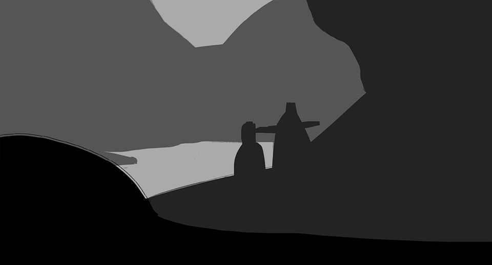 Figure 1.4
 There we go - big, simple masses. Now that we've broken the image down, there's one clear pattern you can see - things that are closer to the viewer are darkest.
This is the result of something called atmospheric perspective, also sometimes referred to as aerial perspective. It basically states that the darkest value you'll see on something gets lighter as it gets further from your eyes. It also states that the most vivid a colour will be becomes less saturated as that distance from the viewer increases. It's caused by the amount of air particles that exist between your eyes and an object. The further away something is from you, the more air that light has to travel through to reach you. These air particles cause the light to scatter.
Beware that the lightest values can still go all the way to white regardless of how close or far they are. Because of this, you're going to see a lot more contrast on something that is closer to you than something that is farther away. As it gets further away, the range of values that can be used to paint it grows smaller.
 Figure 2.1
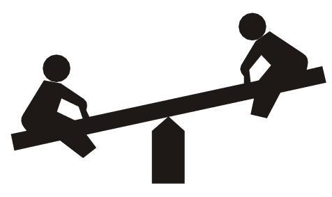
 Balance
Often when people think about balance, they think about a see-saw - a plank that balances on a wedge at its center. This physics-based model requires symmetry - you've got to have the same amount of mass on each side for it to balance out and sit perfectly horizontally. I'll tell you something right now that you're going to have to remind yourself often, as it takes a long time to sink in: symmetry is bad. Symmetry is boring. It's predictable and it's uninteresting.
Instead, lets change the model - lets slide the pivot on which the seesaw balances over a bit, so one side of the see-saw is longer, and the other is shorter. Now, in order to reach perfect equilibrium (balancing horizontally), we need to put more weight on the shorter side, and less on the longer one. We'll achieve balance, but it will be assymetrical. It'll be more interesting.
Looking back at our major masses in figure 1.4, you can think of a darker value as having more weight. Our two big players for weight are therefore our two darkest values. The lighter of the two is larger, with the majority of it sitting on the right side of the composition. Almost all of our darkest value however is clumped up on the left
 Figure 2.2
 This way, we've shifted our center of balance (represented by the red vertical line) over towards the left. If that red line sits right in the middle of our composition, it's probably going to be fairly boring. If it ends up off the canvas, the composition is likely broken and unbalanced.
While you may find this a little complicated at first, your subconscious already knows this. We're all secretly very good at understanding the balance of a composition at a glance. We don't know why something might be unbalanced, but we tend to know if it is or not.
When you look at a well composed image, you don't find yourself floundering, darting your eyes all over the place. You know exactly where to look, because the image itself tells you where to direct your gaze. It does so by defining one or more focal points.
A focal point is established through a variety of ways - I will outline a few, but know that there are several.
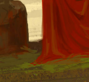 Figure 3.1
 Contrast. This is produced when extremely different pieces of visual information are placed right beside each other. You can have value contrast by putting a very dark area right next to a very light area, you can have saturation contrast by putting a really vivid blotch of colour next to something very pale and grey, and you can have hue contrast by putting two complimentary colours beside each other. I'm not going to jump into colour theory, but complimentary colours are those that sit opposite each other on the colour wheel - red and green, blue and orange, yellow and purple being the main ones (though every colour has its own specific complimentary hue).
Contrast can very quickly cause a sensation of noise or business. These are often referred to as problems with an image, but that is only because they are not used properly. Everything presented here is a tool to draw the eye, but drawing the eye by accident where you don't want it to go can be problematic. We'll get into that in a bit.
 Figure 3.2
 Faces. As human beings, we are always looking for something we can relate to. Something alive, something with a face. Human faces are the biggest draws, but this can be applied to animal or creature faces as well. This is at least partially taking advantage of our evolutionary biology. We have to be on the lookout for threats, and we tend to be quite good at it.
By including a visible face somewhere in your composition, there is a chance your viewer will look at it. You can affect how strong this draw is by incorporating contrast - increasing it to make it a very strong focal point, or decreasing the contrast to weaken its attraction.
 Figure 3.3
 Convergence. This relates very much to perspective, because that's all about parallel lines converging at vanishing points. Convergence causes a lot of lines to point directly at a singular location. Especially in situations where that location is directly on your canvas - like a strong 1 point perspective - this is going to draw your eye right to that location.
Now, as the eye rushes towards this location, it's expecting something juicy. It's been told that there's something worth looking at right over there, but if your composition doesn't deliver, you'll be dashing your viewer's subconscious hopes all over the place. You don't want to disappoint your viewer, so there had better be something at the end of the rainbow.
I have a slight tendency to mess this one up, because I don't keep as close an eye on my perspective as I should. It's not that I don't have something good at the end of the rainbow, it's more that... it's slightly off from the end of the rainbow. I've gotta work on that!
 Figure 3.4
 Portals. This is very similar to the convergence piece. A portal is a fancy word for a window or a door - to be more accurate, it's just a framing device. Something that literally draws a frame around some space in your composition. That naturally tells the viewer's brain, "look here! there's something to see!" I mean, why do you think we frame pieces of art when we hang them on our walls? It's where we want people to look.
Again, if you're framing a blank canvas, you are a downright disappointing jerk. Deliver on your promises.
I have hinted above that there are ways to decrease the draw of any given focal point. You can decrease the difference between two contrasting values, you can make other vanishing points more significant, or you can simply make a portal-frame less noticeable.
If, however, you have two focal points that draw the viewer's eye equally, then you end up with competing focal points - which is bad. The viewer is now given two choices of where to look. Not only does this rob you of the absolute control you need to tell your story, it also confuses the viewer. They don't want choices - they want to be told where they should be looking.
So, you should always be thinking of your focal points in terms of primary, secondary, tertiary, etc. You don't always need multiple focal points. Having just one will make a shot more static, but that's not always a bad thing, depending on what you're trying to depict. Conversely, having a whole whack of focal points can be cumbersome and difficult to manage. The sweet spot is usually two or three.
Where indeed. There's a few tricks that can provide you with suggestions as to where to put your focal points, but ultimately that decision is up to you. Between the rule of thirds, iconic composition, golden ratio, blah blah blah... There's a lot of options. They depend heavily on what kind of scene you're trying to produce, and they are all suggestions. Some people hang too much off the rule of thirds, it drives me a little crazy. That said, they are good suggestions, and you should follow them until you fully understand why you might deviate from them.
The Rule of Thirds
 Figure 5.1
 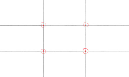 Figure 5.2
 This one's the best known. As shown in figure 5.1, you simply divide your canvas into thirds, both horizontally and vertically. You end up with four points where these division lines intersect. Any one of those intersection points would be a good place to turn into a focal point.
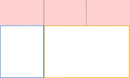 Figure 5.3
 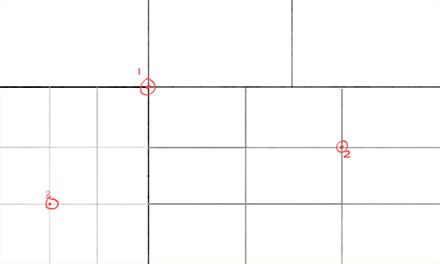 Figure 5.4
 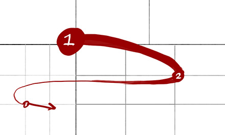 Figure 5.5
 However, if you want a more structured approach to including a secondary and even tertiary focal point that will cause the viewer's eye to flow smoothly over the whole of your image, you can take a look at figure 5.3.
Your first focal point cuts the scene into three sections. The most narrow is discarded (the one blocked off in red). The larger of the other two (orange border) is where you'll put your secondary focal point, and the smaller (blue outline) is where you'll put the tertiary focal point. Both of these are then subdivided and we reapply the rule of thirds within those isolated spaces. Again, any of the intersection points will function as a well balanced focal area.
What we end up with is a smooth, flowing line that goes back and forth across the canvas.
Golden Ratio
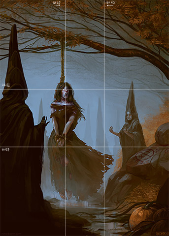 Figure 5.6
 The golden ratio is very similar to the rule of thirds, and there's a lot of debate as to which one's more pleasing. Where the rule of thirds has you drawing a line 33% (one third) of the way in from each edge of the canvas, the golden ratio has you drawing a line 38.2% of the way in.
It is clearly much more difficult to measure, but when creating a composition, you'll often find artists experimenting with a variety of compositions, poses, layouts, etc. through the use of thumbnails. It's a good idea for you to do the same, experimenting with as much as you can before settling down on what you feel works best.
Iconic Composition
 Figure 5.7
 Iconic composition is often used for character pieces. In this type of composition, the focal point tends to be much more central in the piece. This risks establishing a very symmetrical layout, and sometimes that is very much what you want. It'll be static, but it'll give you a very clear shot of a single character.
To lay out the iconic composition guides, you draw lines connecting the midpoints of the neighbouring edges of the canvas (creating that central diamond shape) and you also draw lines across from each corner.
All of the important stuff sits within the diamond, and you can place little bits of interest at the intersection points of the lines.
I will admit, I personally get sloppy with this kind of layout. Sometimes I get cocky and place focal points where I feel they'll work best. Sometimes it works out well, sometimes it actually aligns exactly with some of these techniques (like the examples I used - their matching up was coincidental), and sometimes it results in a lot of haphazard changes and frustration. Following these techniques will help avoid the latter.
So, let's say we've got two focal points. What's probably as important as the focal points themselves is how the viewer's eye moves between them. It's about the journey, not the destination, after all. That analogy works pretty well too - people like roads. They'll take the path of least resistence, and since they don't know yet where you're leading them, they'll follow whichever road is easiest... which in a poorly composed image, can lead them right off the canvas.
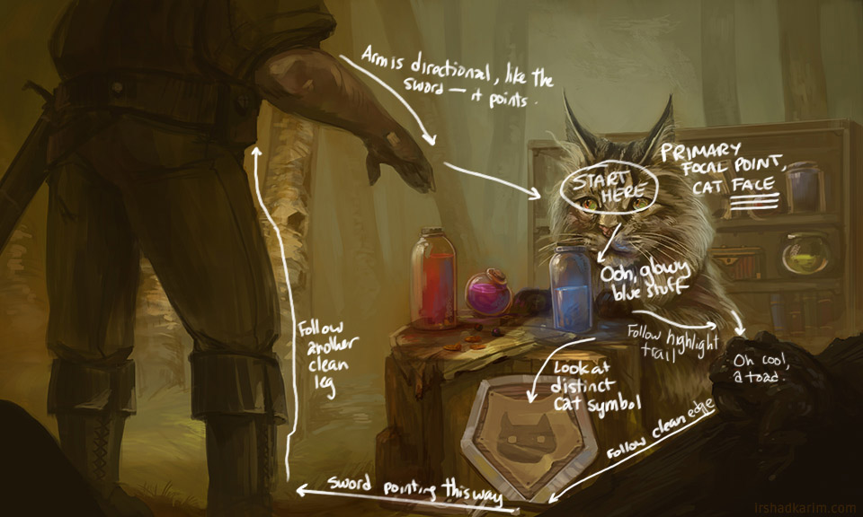 Figure 6.1
 The flow of an image is not always concrete, but there are ways you can encourage your viewer's eyes to move. Defining a clear primary focal point is extremely important. Then, you can use the following tools to lead to other lesser focal points:
- Proximity. If something interesting is fairly close to your primary focal point, it's a fairly easy jump to move there. Just be careful of making these two focal points compete. Once you're already in the area, it doesn't take a lot to make something look mildly intriguing. In the example above, all it takes is a little blue glow.
- Trails. They're like bread crumbs - little distinct details that form a pattern or a path will entice your viewer to follow along.
- Clean edges. A clean, distinct edge is basically the smoothest, easiest way to travel.
- Directional elements. An arrow is an instruction - it tells you to go in a certain direction. Other objects can perform a similar task, if they look like they've got some kind of direction to their orientation. In the example above, the sword on the ground (which is kind of blocked by my handwriting) points towards the customer's boot. The customer's hand is also reaching forward, pointing towards the cat/potions.
If at any point a path leads to the edge of your frame and there's nothing physically blocking that path from extending right off the image, the viewer's eyes will leave your scene. This is a great way for them to move on, which you don't ever want them to do. You want them to stay in a closed loop and look at your marvelous image forever, pondering "why the hell is a cat selling potions?!"
The first exercise is to find some still frames from films and to study their composition and cinematography. We study them by replicating simplified breakdowns of their overall shapes. Similar to how we broke down the painting in the 'Values' section, we will first focus on capturing the major shapes and masses, and then carving those silhouettes. We will not deal with any internal detail whatsoever. Only silhouettes.
The website I used to find my reference was film-grab.com. You can also pull stills from whatever movie files or DVDs you might have. Try and choose ones with strong compositions - ones that don't make you feel confused as to where you should be looking, but make you feel comfortable and seem to be telling you a story. It may be easier to do get a sense for this with movies you haven't seen before, since you wouldn't know the story or the relevance of the scene beforehand.
You should also try and find relatively high-res stills. You'd be hard pressed to find anything larger than 1080p, but don't settle for less than that.
 Figure 7.1
 For this study, I chose a still from The Dark Knight (2008). I chose this one because it has a clear breakdown of values - you've got a character in the foreground, the vertical and horizontal bars of the window structure in the middleground, and a background that consists of fairly light values. There is some blending between the value ranges of some of the midground and background though, so it's complex enough to give us a little to play with.
There is a recording of this demo for my patreon-supporters, available by clicking the link below.
 Figure 7.2
 I started off by laying in my background and blocking in the major shapes of the background. I don't like using layers excessively, so at least when I'm starting off, I'll start going from back to front. I'm trying to focus on the shapes here - it's very easy to see a steel beam, and then draw that beam. Instead, ignore the separation between objects and look at the values. We'll focus more on this later.
 Figure 7.3
 With the general shapes of my midground blocked in, I start blocking in my darkest shapes - the main figure. He is the focal point, so I want to make sure I start with him. Since your actions are affected by your mindset, it's important to regard that figure as your focal point.
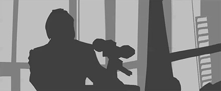 Figure 7.4
 Now I'm starting to look back at what I mentioned before - looking at the values in the scene rather than the individual objects. Many objects may come together to form a single value-mass, so it's important to construct them as though they exist as a single shape.
Furthermore, I'm starting to use the middle-grey to block in some of my background elements. I made the choice of extending what I constitute to be the midground to incorporate more of the shapes that are present in the scene. Again, this is a matter of stopping myself from looking at the objects literally. Everything is a shape with a value. If those values seem to be closer to my middle-grey, then that's what I'm going to use to block them in.
 Figure 7.4
 The last step is a lot of refinement. This is a very simple study, but I'm still paying a lot of attention to pushing and pulling my shapes. I don't erase - I push, and I pull. I'll paint in a shape with one colour, then carve back into it with another.
I absolutely want you to stop at the silhouette stage. The focus of this exercise is not to replicate a film still in beautiful detail, but to understand how to see shapes as existing beyond the boundaries of literal objects. It's much more difficult than it sounds.
This exercise is more creative - essentially, paint your own value thumbnails. They should be greyscale, and explore how you can use shapes to create interesting compositions. You should also be considering a narrative - that is, tell me a story. It can be a ridiculously simple story, but you should think through what's happening.
You don't necessarily have to know what's happening before you start. More often than not, a story may emerge as you play with shapes and values. Just make sure you are listening when that story starts whispering in your ear.
Your process should be as follows:
- Start off with basic, sweeping shapes to achieve overall balance and the beginnings of an interesting compositional structure
- Nail down your focal points as you settle into a particular shape arrangement
- Refine your shapes - carve into them, I don't want to see any nonsensical blobs beyond this point. You should be beginning to figure out what's what
- Imply some detail within your silhouettes. You don't have to do this if you're not comfortable. It'll be easier if you've completed some of the dynamic sketching and figure drawing lessons, as you'll have a stronger sense of form
Remember. Everything starts off as a shape. Your biggest priority is hammering down shapes that look interesting together. At its core, composition is all about graphic design. Once you've nailed that down, you have to start explaining. You take a shape and say, "well this looks like a person" or "this looks like a big rock". It may seem backwards, but it is the best way to end up with a strong composition.
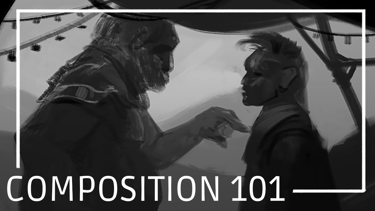
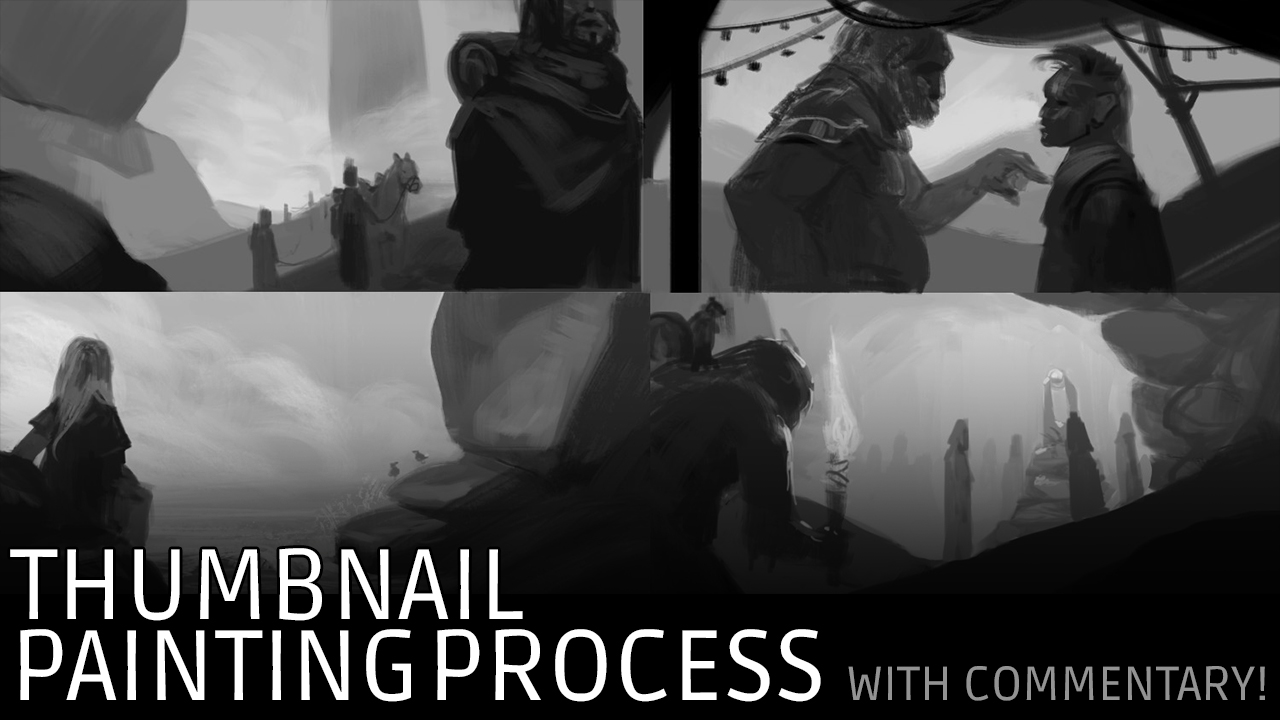
Below are two videos that are freely available to everyone. Composition 101 goes over some of what was presented in this lesson (though the lesson explores composition in greater depth) and Thumbnail Painting Process gives an idea of how you should approach this exercise.
Any medium is fine for this exercise, but I discourage you from using any tool that is more oriented towards drawing lines rather than strokes of varying size. Digital would be my choice for this subject matter, but watercolour, gouache, acrylic, oil, wide markers and brush pens would work fine as well. If you're feeling adventerous, you could even try doing it with construction paper and a glue stick. It is after all, all about shape. I'm kidding. Mostly.
As homework, I recommend doing at least:
- 10 film still-frame studies. Do not go beyond silhouettes, but be sure to spend some time refining those shapes. film-grab.com is a good source of reference
- 10 thumbnail paintings. Aim for something like this. Also, if possible, work on them on the same canvas rather than individually
As always, there is no need to rush. This is not an exercise in speed-painting. What I want to see are well thought out shape arrangements. Take as much time as is required to achieve this.